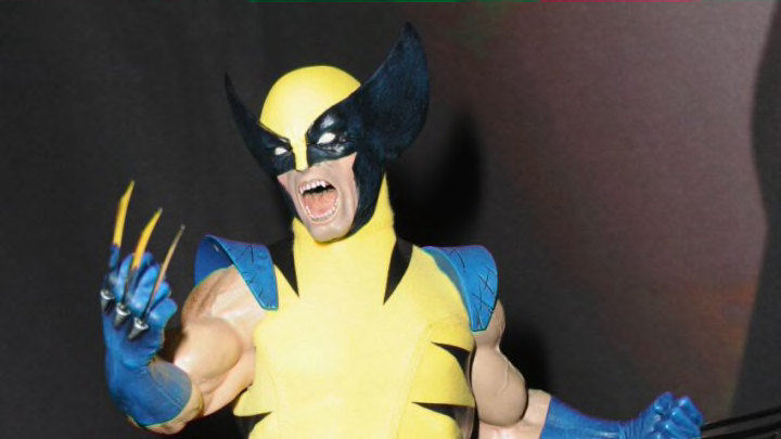
15. Armor
In Wolverine No. 6 by Paul Cornell, Logan loses his healing factor. As T’Challa pointed out, Logan’s fighting style is based on his ability to take punishment. Without his accelerated healing, he needed a new way to fight. The Superior Spider-Man had an answer for that. He built armor so Logan wouldn’t have to change anything.
This design was cool. It was yellow with black forming an “X” around the front and back of his costume. There was also an attachment to the hands for claws to pop out so Logan didn’t have to use his own. The mask remained the same as always. This makes sense as it’s a signature look for Wolverine.
This was one of the best original designs Wolverine has had. Too bad this was during one of the worst times of his life.
Grade: A
14. Age of Apocalypse
This was a similar design to the original. The significant difference was the colors. First, it was predominantly blue instead of yellow. Instead of black stripes, they were red. The other distinction is Logan was missing a hand thanks to Prelate Summers (Cyclops). That became the biggest indicator of which Wolverine this was.
There’s also another version of Wolverine in this universe. Logan became Apocalypse. He had En Sabah Nur’s classic armor and used his missing hand as a cannon.
Neither of these designs was great or horrible. They kind of just existed.
Grade: C
