4. Enchantress in Suicide Squad (2016)
Suicide Squad had us all geared up for a thrilling ride through the dark and edgy corners of the DC Extended Universe, eager to meet its roster of antiheroes and villains.
Among them, Enchantress stood out with her mysterious vibes and ancient witchy powers, but when it's time for her to unleash her full might, the CGI feels like someone let the air out of a balloon. Instead of being whisked away to a world of awe-inspiring magic, viewers were left scratching their heads at visuals that seemed more akin to early 2000s video game graphics than a blockbuster spectacle. Her swirling, smoky powers and the overall execution lacked the depth and texture that modern audiences have come to expect, making her big moments feel less "epic witch queen" and more "my first magic trick."
The heart of the issue with Enchantress's CGI isn't just about the visual effects not being up to snuff - it's about how those visuals fail to connect with the audience. When she's casting spells and bringing chaos, you want to feel the weight and danger of her power. Instead, the underwhelming CGI made her seem less like a formidable foe and more like she was just floating around in a CGI bubble, not fully integrated into the gritty world of Suicide Squad. It's a bit like watching a high-stakes dance-off where one of the main dancers is missing the beat – you can appreciate the effort and understand the potential, but the execution just doesn't hit the mark.
Despite this, the charm of Suicide Squad lies in its chaotic ensemble and daring spirit, ensuring that a bad script or even a CGI misstep couldn't completely derail the fun of this villainous romp.
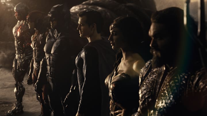
5. Steppenwolf in Justice League (2017)
Hiccups aside, Justice League had us viewers gearing up for an epic showdown.
Popcorn in hand, eyes glued to the screen, we ready to see our heroes face a villain so menacing, he could give you nightmares. Then comes Steppenwolf, the big baddie... except, he looks like he's just wandered out of a bad 2003 video game cutscene. It's like expecting a gourmet meal and getting served a bowl of cereal. The CGI used for Steppenwolf was so cartoonish, it was hard not to giggle instead of tremble.
His armor looked like it was made out of shiny, plastic beads from a craft store, and his movements felt less like a powerful overlord and more like someone trying to navigate the world in oversized, clunky boots. Our excitement turned into a mix of disbelief and disappointment. How could the mighty Steppenwolf, the herald of doom, look less threatening than my neighbor's Halloween decoration?
The uproar wasn't just about his aesthetics, it was about the missed opportunity to truly immerse viewers in the DCEU's world. Visual effects can make or break the believability of a character, especially in superhero movies where the extraordinary is the norm. Steppenwolf's lack of texture, depth, and, frankly, intimidation factor made it challenging for audiences to buy into the stakes of the battle. It's like trying to convince someone that a teddy bear is a ferocious beast. The disconnect was so jarring that it pulled viewers out of the cinematic experience, turning what should have been a gripping fight for the fate of the world into a moment many wished they could CTRL+ALT+DEL from their memory.
In a universe where visuals have the power to transport us to otherworldly realms, Steppenwolf's rendering was a stark reminder that even superheroes can't always save us from the perils of subpar CGI.
